-
Bug
-
Resolution: Fixed
-
Major
-
2.2.0
-
None
-
4.3 RC2
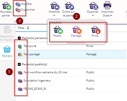
Colors between the tool (1) and the ribbon menu (2) are not the same :
| Private | Shared | Public | |
|---|---|---|---|
| Ribbon | Red | Orange | Green |
| Tool | Green | Orange | Purple |
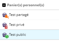
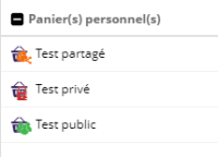
Additionnaly, maybe we should have white icons into a colored circle like in the menu (3) to have a best readability.

- Est référencé par
-
QUERIES-106 Inconsistency between visibility decorators in the ribbon and the tool
-
- Closed
-


