-
Bug
-
Resolution: Unresolved
-
 Major
Major
-
None
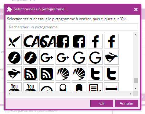
When choosing the glyph for a view... the glyphs are too bug (font 40 for 48px) and can overlap each other
When choosing the glyph for a view... the glyphs are too bug (font 40 for 48px) and can overlap each other
 Raphaël Franchet