-
Improvement
-
Resolution: Fixed
-
Major
-
4.0RC3
-
None
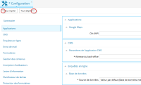
The icons + and - are better. You can also use more elaborate icons. But << and >> have no sense.
- Fait partie de
-
RUNTIME-1854 Layout of the configurable form panel when it has a table of contents
-
- Reopened
-
