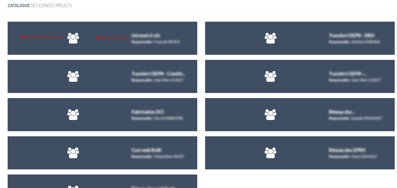
At this time all the projects are displayed on two columns. It could be nice to have 3 columns on a wide screen, 2 column on a smaller screen and one on a mobile.
Then it could be nice to give more space to the text instead of the icon
At this time all the projects are displayed on two columns. It could be nice to have 3 columns on a wide screen, 2 column on a smaller screen and one on a mobile.
Then it could be nice to give more space to the text instead of the icon
 Frederic Ravetier (Inactive)