-
Bug
-
Resolution: Fixed
-
Major
-
None
-
None
-
2.2.0
-
WORKSPACES 2.0.0
On IPad Pro resolution , there are following points :
Point 1 :
If we open the filter, then button "Nouveau Projet" is truncated :

Point 2 :
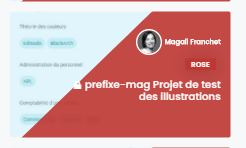
For this project title, 'locked' icon is not correctly visible (text should be shifted to the right) :

Point 3 :
If there are some public projects, if user enters a filter,
Buttons "Mes projets" and "Projets publics" appears on 2 lines => Is it ok ?

